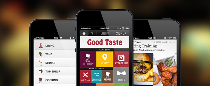
Points to keep in mind when designing a mobile website for your online business
In the last one year, traffic on mobile devices in US has simply doubled making it almost 25% of the web traffic. Further, the network company Cisco has a prediction that by 2016 mobile traffic will overtake the desktop traffic. As mobile network is becoming fast, smartphones are becoming affordable and reliable, there is a surge in the number of individuals who use their mobile device as a desktop replacement. As the trend continues and more people move away from their desktops to their mobile devices, website owners have to make sure that their readers and customers get a pleasant mobile experience. In order to reach more potential customers, it is imperative for you to create a version of your website optimized for smaller devices. This Website should be a “lite” version of your main website; containing lesser graphics and cut on other heavy features like videos, should be compatible with mobile browsers and operating systems. Make sure that your website navigation is straight forward, content is clear and concise, leading customer directly to the point about the products and/or services you have to offer. On mobiles, speed matters on the first place; it should load within the minimum time possible, so that visitors do not lose interest while browsing the same. Still, a footer link of Desktop version is a must so as a customer has the option to move to Desktop version in case he need to. Here are a few things that matter in mobile optimized websites, which if followed, can help online business owners improve their sales.
Make search the epicenter of the webpage:
Unlike a desktop internet user, users of mobile devices don’t have the real estate they need for cumbersome navigation and hence need everything essentially on their fingertips. One way to ensure that is by making the search box the epicenter of the entire webpage. The search box should be clearly visible, highlighted, and accessible from all pages. Moreover, the search algorithm should make use of type-ahead or auto-complete feature for commonly searched terms, which come in handy if the search term is long. Additionally, if somebody has made a typo, the search algorithm should automatically display the correct results.
Sorting and filtering search results and product list pages
Although sorting is quite important in desktop optimized websites, its importance in a mobile optimized website is even greater. Sorting can help internet shoppers easily organize the large list of results to fit their precise requirements. Website developers should use buttons or drop down menus that allow the visitor to filter the results on his/her query, based on precise requirements, which might be color, size, type, brand, price, consumer rating etc.
Develop a flexible webpage
Obviously, a mobile website designer cannot design different interfaces for the thousands of types of Smartphones that are available in the market today. One way to sort out this riddle is by focusing on the limited number of mobile web browsers, make use of their capabilities, and make use of fluid grids and extremely flexible web layouts. This will help the website to alter its appearance according to the display size and resolution. This not only applies to the layout of the webpage, but should be followed to display product images as well, where the webpage can either dynamically crop the image to display the most important elements, or entirely resize the images for even better results.
Site-wide navigation
Although the homepage of a desktop-oriented website is its main navigational hub, conditions are quite different for a mobile-optimized website. Not many mobile internet shoppers have the time to go back to the homepage to go from one part of the e-store to the other, hence it is a great option to have a dedicated navigation button at the top corners of the screen on all sub-pages of the website, which when clicked or touched, can display the complete menu of the website.
Pages for products and picture galleries
Owning to the fact that not many mobile internet shoppers love scrolling through a long webpage, website designers should ensure that they follow a “Tab” pattern or use accordions to progressively display more information, when and if the user wants to check them out. This way the long pages can be transformed into more manageable and user-friendly chunks of content, which open up only when the user requires. Moreover, since in this way the entire page loads, without the user even noticing that, the user can access the hidden information even if his/her network connection drops. Along with that, the developer has to give special consideration to the design and rendering of picture galleries to make sure that they don’t clutter the interface. Some of the most reputed online stores use swipe-able galleries, which show thumb-nails of all the photographs, which enlarge only when the user clicks on them. Additionally, according to the products that are available on an online store, the developer can add further options that allow the user to check out the different variants of the product from the same angle by simply clicking the relevant buttons, which can be added below the images.
Mobile driven customer service
Since you are working on a mobile-optimized website, don’t expect your customers to head over to their desktops if they have to resolve their queries. Rather, integrate a mobile customer service into the website, which can help your customers get their queries resolved on their mobile devices itself. A great way to do this is by making use of Twitter as a customer care platform. Many online retailers are following this practice and to good effect too. You can simply ask your users to convey their queries via Twitter, and ensure that your customer care department replies to these queries within a few minutes.
Create a great checkout process – preferably one page
As mentioned previously too, mobile internet shoppers don’t usually have a lot of time to spend on their purchases and want their transactions to complete within a few minutes. One way you can ensure that is by designing an extremely easy to use checkout page, which includes only the most important details. Don’t expect your customers to fill out lengthy questionnaires just to head over to the payment gateway. Rather, just ask them to fill the most relevant blanks, which can include their name, email address, phone number, shipping details and their payment details. Another great addition to the checkout page on a mobile website should be the ability to checkout as a guest, which means that the user can make purchases without even registering himself/herself on your website. Research has shown that users are more likely to make a purchase if they don’t have to go through the hassle of creating and verifying their account. So simply remove the register button altogether, or give your customers a chance to purchase your product without registering.


Leave A Comment